As 2025 approaches, web design is moving faster than we realize. The future of website design seems to be a combination of aesthetics, functionality, and advanced technology. In this guide, we will discuss some modern website design trends that will likely dominate in 2025.
What are the current trends in website design? Top 11 Modern Website Design Trends for 2025
1. User Experience (UX) and User Interface (UI)
The digital sphere continues to develop an aesthetic sweet tooth, where visual appeal meets functionality, resulting in a good user experience. In this case, a website’s UX/UI is essential, as it directly affects usability and user satisfaction as a whole.
- Aesthetic Sweet Tooth: Consumers today want modern designs that not only look great, but also serve a purpose. They enjoy an intuitive user interface integrated with clean design principles that make the browsing experience more flawless and enjoyable for them.
- Clean Design: The minimal design focuses on simplicity and uses a large amount of white space. It aids in providing a clean UI where, users should only focus on the essentials, without being overloaded by too much information.
- Easy-to-Read Content: Easy-to-read content will continue to be a trend that remains in 2025 and beyond because content is king. Making typography choices and layout decisions helps create scannable content that users can digest quickly.
- Intuitive User Interface: A good user interface is all about how easy it is to navigate the website. As voice-enabled interfaces become more common and the rise of motion design trend takes hold, this type of interaction is fully inline with new user expectations for smart interactions between their devices and the web.
- Motion Design: It consists of animations and transitions that lead users through their journey on the website, which help provide visual pointers and aid in the storytelling aspect of the design.
- Voice-Enabled Interfaces: With the advancement of technology, the incorporation of voice-enabled interfaces is increasing. It enables users to interact with the website using their voice, thus making it easy to access and inclusive.
- White Space: Proper white space helps keep the user focused and helps them understand content better. It provides a breathing space for every element on the page, promoting a sense of elegance and openness.
2. Mobile-Friendly Layouts
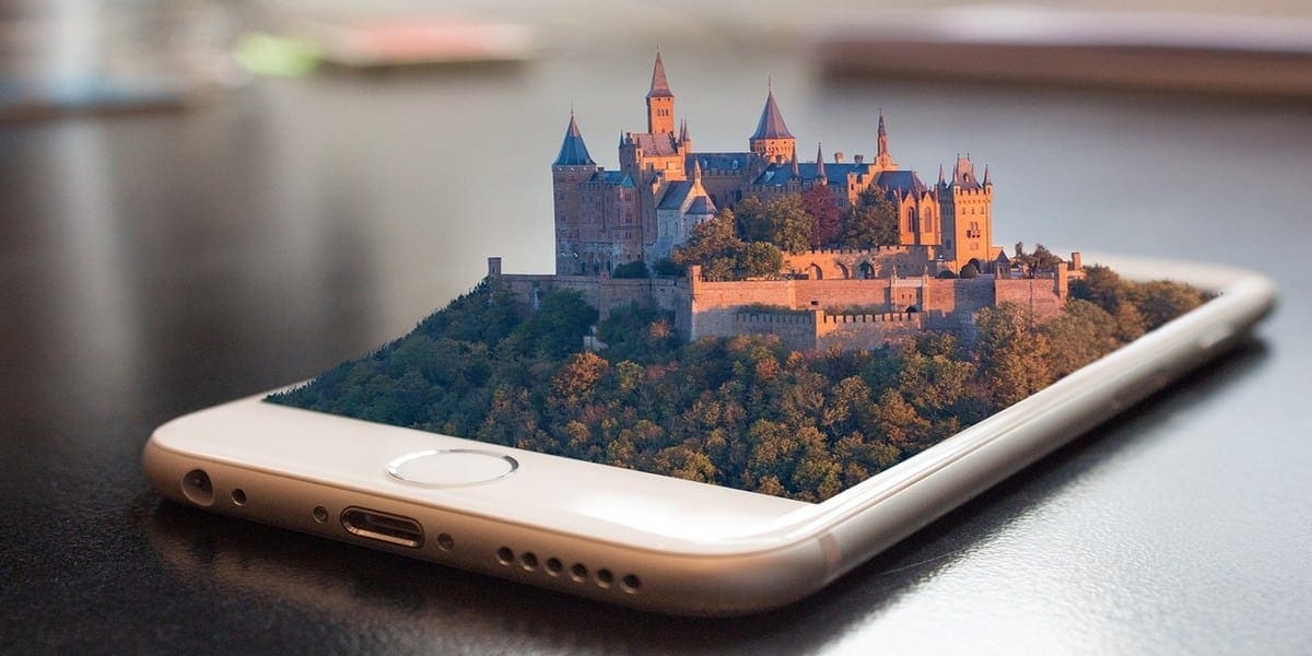
The majority of internet traffic comes from mobile devices, so designing mobile-friendly layouts is no longer optional. Today, smartphone users have grown to billions, so it has become necessary that websites be mobile-friendly.
- Desktop-Friendly Site: While mobile should remain the priority, the old desktop-friendly site cannot be ignored. By striking a balance when optimizing the website for both desktop and mobile platforms, a business will be able to reach more audiences than ever.
- Images and Text: A web designer should choose images and text correctly to avoid misclicks, making sure they resize according to screen sizes as well. This improves users’ experience regardless of their device.
- Responsive Web Design: Responsive web design is the norm, meaning sites automatically cater for varying screen resolutions. This way, you offer an optimal experience for any potential buyers.
- Touchscreen Controls: Touchscreen controls should be relatively intuitive and allow access quickly. Each user interface should be designed to be easy to use, reducing frustration and increasing efficiency.
3. Speed Optimization
A fast-loading website is a must for success. Speed optimization is the key to minimal bounce rates, better user experience, and higher search engine rankings.
- Hosting Environment: The proper hosting environment, whether VPS or dedicated server, can heavily influence website performance, from landing page speed to overall stability.
- Image Optimization: Image optimization is key to maintain speed without compromising quality. JPEG images, PNG images, and, in some cases, even GIFs have to be optimized so that they can load quickly while still looking crisp.
- File Compression: Enabling file compression increases website performance and, as a result, load time. This way, you do not keep your users waiting, which can drive them away from your site.
- Landing Page Speed: The landing page speed sets the first impression for site visitors. Optimizing the landing page speed can radically decrease the bounce rates and increase your chance of conversions.
4. Responsive Images and Videos
Responsive images and videos are a big part of web design today as we move to more visual content in the digital age. These elements are not only decorative; they play a significant role in creating dynamic and eye-catching websites that draw users’ attention at first sight.
- Hero Images: Hero images are usually the main feature when you first land on a homepage, taking up the entire page of view. They deliver a unique perspective and capture the brand’s message. If your design is responsive, this large image will adapt to different screen sizes, maintaining visual consistency across devices.
- Background Videos: Background videos start on autoplay as soon as the visitor lands on a page, which can enhance with the user engagement. They provide an added dimension to the experience, enticing users to scroll and dig deeper into the post. That said, we must also make sure that they are optimized for all devices so your videos are not negatively impacting load speeds or other essential content.
- Text Overlay: You may use a text overlay on images and videos to convey some statements without disturbing the flow of visuals. This approach helps achieve continuity between photos and text, which aids in supporting the brand’s identity while also keeping it easy to read.
- Device Optimization: Another critical aspect of responsive design is that all visual media must be optimized for various devices. This ensures optimal viewing experiences for all visitors, essential to keeping visitor engagement levels high.
5. Typography in Modern Website Design
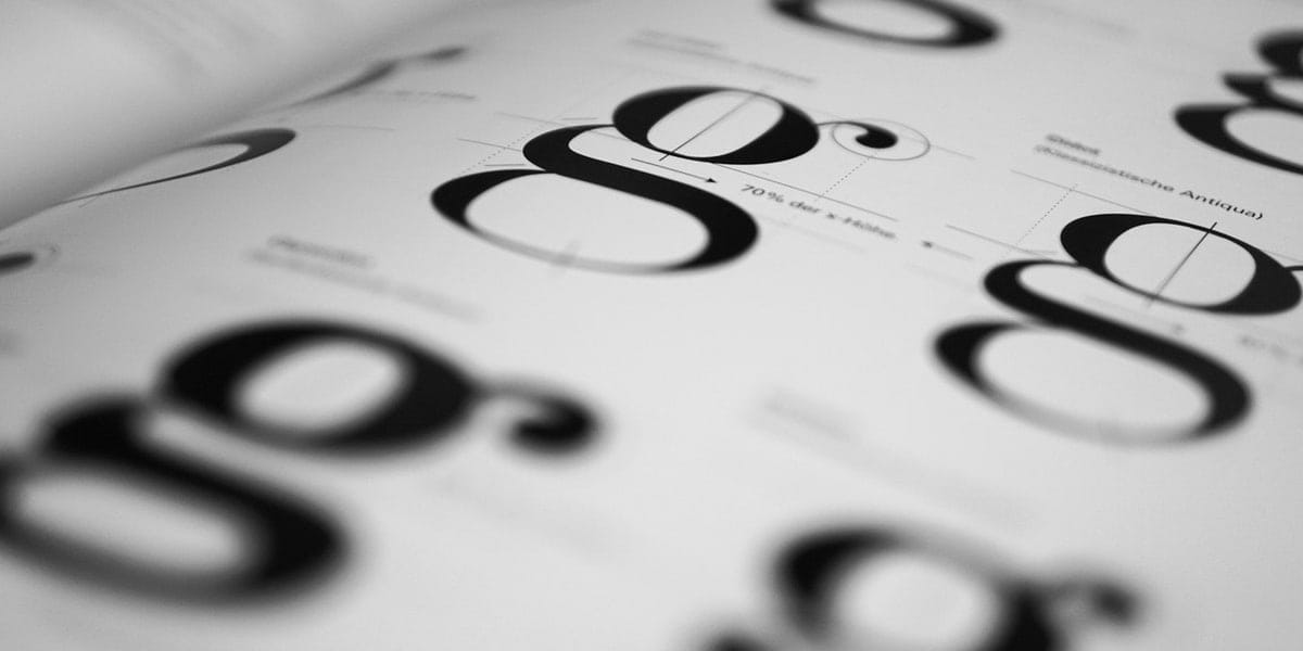
Typography is more than just selecting fonts; it can also communicate personality and values related to your brand. Proper typography distinguishes your website and create a long-lasting impression on visitors.
- Brand Representation: The right typography can express your brand directly. Employ different sizes and fonts in accordance with your company style to make people identify you easily, and have a consistent look on different platforms.
- Font Selection: Choosing the right font also matters a lot in terms of appearance and the way it is used. The fonts should be easily readable on any device and compatible across multiple browsers for a seamless UX.
- Browser Compatibility: Your fonts should function the same in all browsers. To keep the design and brand image intact, your fonts should look consistent across all platforms.
- Uniform Look: When someone encounters your brand on a mobile device or on desktop, using typography consistently ensures that it speaks with one voice.
6. Color Trends in Modern Web Design
Color is a tool that can help web designers to evoke emotions and actions. Given that user trends change over time, knowing the psychology of color and how it impacts human behavior will be beneficial for building effective designs.
- Pantone and Color of the Year: Pantone 13-1023 Peach Fuzz, Pantone’s Color of the Year, is sure to dictate a new trend in design. These color trends inspire designers to use a new range of hues and create their own contemporary aspects.
- Bright Color CTAs: Bright color CTAs attract the eye and prompt a user response. When used strategically, they can subtly lead users toward desired actions instead of being intrusive.
- Muted Color Palettes: A muted color palette is a delicate and refined solution to elegant backdrops which supports content instead of competing against it. You can combine them with pastel shades or gradients for a more sophisticated look that boosts illustrative elements.
- On-Brand Colors: Using on-brand colors helps your website stay cohesive and strengthens your brand identity. These colors can be used in color combos or as stand-alone accents to help reinforce the brand’s messaging and ensure consistency.
- Gradients and Illustrative Design: After disappearing from the scene for a while, gradients are back in vogue and act as a modern way of adding depth to flat design. Gradients add depth and dimension to a website as part of an illustrative design.
7. Custom Illustrations
One of the secret weapons for modern web design are custom illustrations. They are useful to make unique graphics that help websites stand out from the usual stock images found everywhere. These graphics do a great job of improving brand recognition and giving digital platforms more character.
- 3D Illusions and Cursor Interaction: You can draw users in by making websites more immersive by adding 3D illusions and interactive cursor effects to illustrations. It engages the viewers to make a deeper connection with the contents. This trend incorporates complex coding that creates immersion and dynamic movements; it’s a step up from plain web design.
- Alice Lee and Digital Designs: Web design is evolving and custom illustrations from artists like Alice Lee are leading the way. Many argue that custom digital designs can tell a brand’s story better than common visuals. In addition, these illustrations also fuse the appeal of print with the creativity of the web, bringing a traditional touch to new media.
- Brand Awareness: An important tool of brand awareness is custom illustrations. Visually focused on the essence of the brand, they are what make a brand stand out and memorable.
- Coding Capabilities: Designers are now able to seamlessly integrate complex illustrative elements into websites due to better coding abilities. It makes the site more appealing and smooth without slowing it down or losing its functions.
8. Grid and Card Design
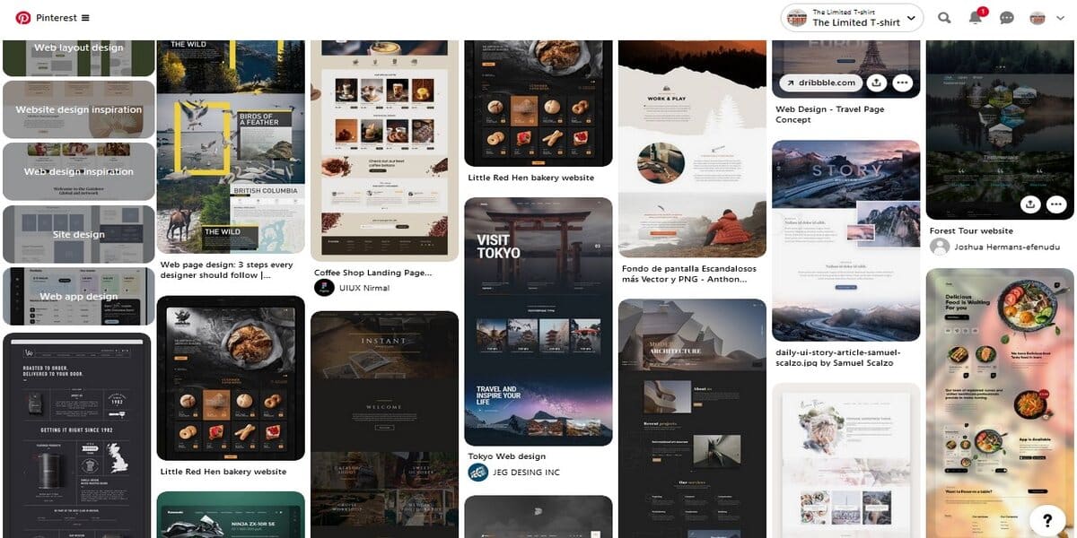
Making sure your website’s content is well-structured goes a long way into retaining users and helping them find what they need. Use grid and card designs to achieve a clean, usable appearance.
- 2D Grid Layout System: The 2D grid layout system provides websites with a stable framework to organize the contents elegantly on it. This has, of course, been made much easier and more flexible than before with CSS grid layout in place (even for content-heavy sites).
- B2B and B2C Websites: Grid and card layouts are effective for B2B and B2C websites. Cards are perfect for segmenting information and as content buckets, allowing you to maintain a unified appearance throughout the page. They are also naturally responsive, which means they will adjust to fit any screen size or device. Moreover, they simplify how information is consumed by visitors. This design trend has influenced the way we view (and interact) with information on the web.
- CSS Grid Layout: CSS Grid Layout is a two-dimensional grid-based layout system used to create responsive layouts with seamless and cleaner code. This means you will have a more straightforward time creating complex layouts, i.e., laying out products/services in an engaging and accessible way.
9. White Space in Modern Website Design
White space in web design is not purely aesthetic — it also serves an essential purpose, such as legibility and readability of the content. It helps emphasize key components on a page and increase the overall user experience (UX).
- Breathing Room: This white space provides breathing room for all of the elements on-page to ensure that your website does not appear cluttered. It helps users move across content very swiftly, which makes it easier to consume and contributes to good understanding and leads to easy conversion.
- Comprehension and Conversion Process: White space assists with conversion through enhanced understanding. People are naturally more inclined to respond to content when the layout is straightforward and clutter-free.
- Featured Product Image: Having a featured product image with lots of white space around it could draw your visitors’ attention toward its importance. It is another simple thing that is key in minimalist web design and helps to organize the structure of your site.
- Modern Site Frameworks: Fortunately, a decent amount of modern web design frameworks come with white space from the get-go. They understand that it is crucial to establish a visual hierarchy, which guides visitors through the website or platform.
- User Satisfaction: Ultimately, the subtle use of white space can really improve the user experience. It maintains a well-organized content layout, improves user experience, and makes essential web elements easy to use on the front end.
10. Full-Page Headers
These days, full-page headers are standard in modern websites; they make a strong impression and set the tone for what visitors can expect during their visit. This design trend allows for a powerful first impression. Take Discord as an example. Fun is flawless with their full-page headings. They combine utility and interesting visuals to attract users from the get-go. The header is like a welcoming door to the site’s community and what it has to offer.
- Call-to-Action (CTA) Buttons: Including call-to-action (CTA) buttons above the fold in full-image headers helps users start interacting as soon they arrive at a site. These buttons are in a common area where people expect to see them, which makes them more eye-catching and provide more clicks.
- Eye-Catching Images: Use eye-catching images that grab the user’s attention and instantly deliver your brand message or value proposition. A stunning photo or bold graphic is key in making users care.
- Header Variations: Designers can work with a multitude of header styles ranging from static images to videos with background animations. Every style has its own way of grabbing visitors and making them explore further into the website.
- Text-Scanning Patterns: Understanding basic text scanning techniques will only help better design full-page headers. By putting the more important information in spots where eyes go first, you make your message loud and clear.
11. Parallax Scrolling
Parallax scrolling will be essential to brighten up a static 2025 web design landscape with more depth and interactivity. It’s a very interesting design trend for modern web development, as it gives more depth to the website’s appearance. This trend offers different speeds of scrolling between the foreground and background to create an illusion of three dimensions.
- Background Video: Integrating a background video with parallax effects can result in a captivating visual narrative that enhances storytelling and user engagement. It’s a dynamic approach that brings content to life as users scroll through the page.
- Dynamic Scrolling: Dynamic scrolling techniques, such as scroll-triggered animations, make the journey through a website more fun and interactive. These animations activate at specific points during the scroll, maintaining user interest and encouraging continued exploration.
- Interactive Content: Interactive content is a cornerstone of parallax scrolling, providing users with an engaging way to interact with the site. This method not only entertains but also deepens the user’s connection with the website’s content.
- Site Exposure: Employing parallax effects can increase site exposure by creating memorable experiences that users are likely to share. A website that skillfully uses parallax scrolling can quickly become one of the trendiest websites, setting a standard for others to follow.
- Scroll-Triggered Animations: Scroll-triggered animations add a layer of excitement to the user’s journey. By revealing content dynamically, they keep the narrative fresh and ensure that each scroll uncovers something new, boosting overall user engagement.
How do you style a modern website: Tips to build a website the modern way
Include these seven tips in your website design to strengthen a site’s visual identity and usability:
- Have a clean and tidy layout. This ensures easy navigation through your website and makes sense of its structure.
- Opt for stunning images that will surprise and capture your viewers. The perfect images, colors, and accents can make your site shine.
- Utilize typography for better user engagement. It helps visitors to site stay a bit longer on your because clear text and good copy improve readability. Arial or Verdana fonts work well for text within content and headings.
- Optimize white space to make your pages load faster while still appearing attractive.
- Use buttons sparingly.
- Compress files whenever possible to increase the speed at which your pages are loaded.
- Consistency is key. Ensure consistent branding throughout your entire website.
5 Best Modern Website Designs of the Moment
1. Umani Ronchi by ATK+LAB
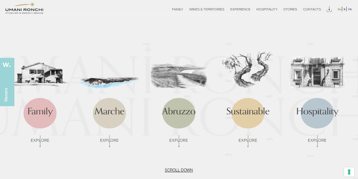
Image Credit: umanironchi.com
Standout Features:
- Video storytelling.
- Vital events in a carousel.
- Delightful monochromatic illustrations.
ATK+LAB’s design for Umani Ronchi is like having a knowledgeable guide while you sip on fine wine. On the homepage itself, you are greeted with five engaging categories, highlighting what the brand does best. They are showcased with pastel bubbles around clean typography, topped with sophisticated monochromatic drawings that immediately transport you to Umani Ronchi.
When you browse through, full-screen photography is there to take the vineyard’s stunning landscapes and urban scenes directly into your home. Explore the story behind this brand through engaging videos, like you are watching your favorite documentary series. And there’s a carousel of time capsules leading you down the aisle with memorable moments from their history.
2. Prosvirin Design by mkey media
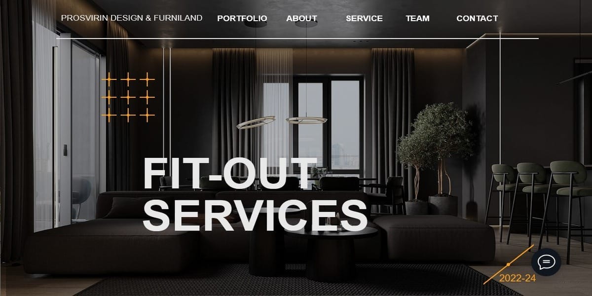
Image Credit: prosvirindesign.eu
Standout Features:
- Monochromatic elements blend
- Focus on photography
- Minimalist approach
The Prosvirin Design website by mkey media illustrates minimalism exemplified and conveys the core concept of expert interior design. The site is built around a minimalistic design, featuring interior room designs with photographic backdrops offering an elegant setting for lightweight typography. The coherent look is maintained from the homepage to testimonials, spiced up with monochromatic sections and content blocks.
Key text is bolded to emphasize important information, while subtle counters highlight the brand’s achievements. The whole thing is complemented with capturing images from their portfolio.
3. Pharmacy at the Triumphal Arch by Plural
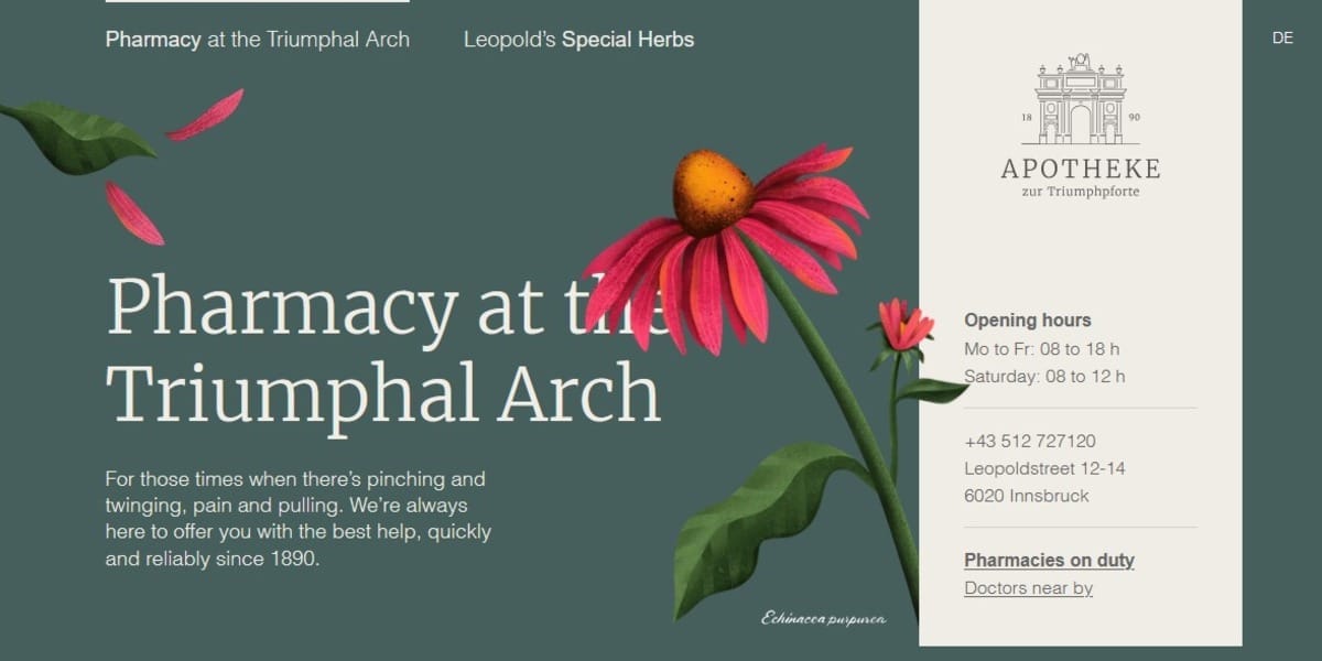
Image Credit: triumphpforte.at
Standout Features:
- A flower swaying in the summer wind
- Smart use of positive space
- Dual single-page layout
The design that Plural imagined for the Pharmacy at the Triumphal Arch makes clever use of modern design elements which guarantee fluidity during browsing. This modern website design says a lot about how comfortable this pharmacy feels, and the satisfaction it provided over the years.
At the very top, users can toggle between two single-page views: one spotlights the brand’s long legacy and the other highlights the herbal products that Leopold Bichel introduced in the 19th century. The two pages now boast a new color palette of green and white, along with what we can only describe as a digital flower that gently sways back and forth, simulating a breeze.
It is a layout that embraces positive space and minimalism. You can peruse galleries within one frame. Then, as you scroll down, you find short texts under clickable header lines.
4. AR–CO by Lukas Rudrof
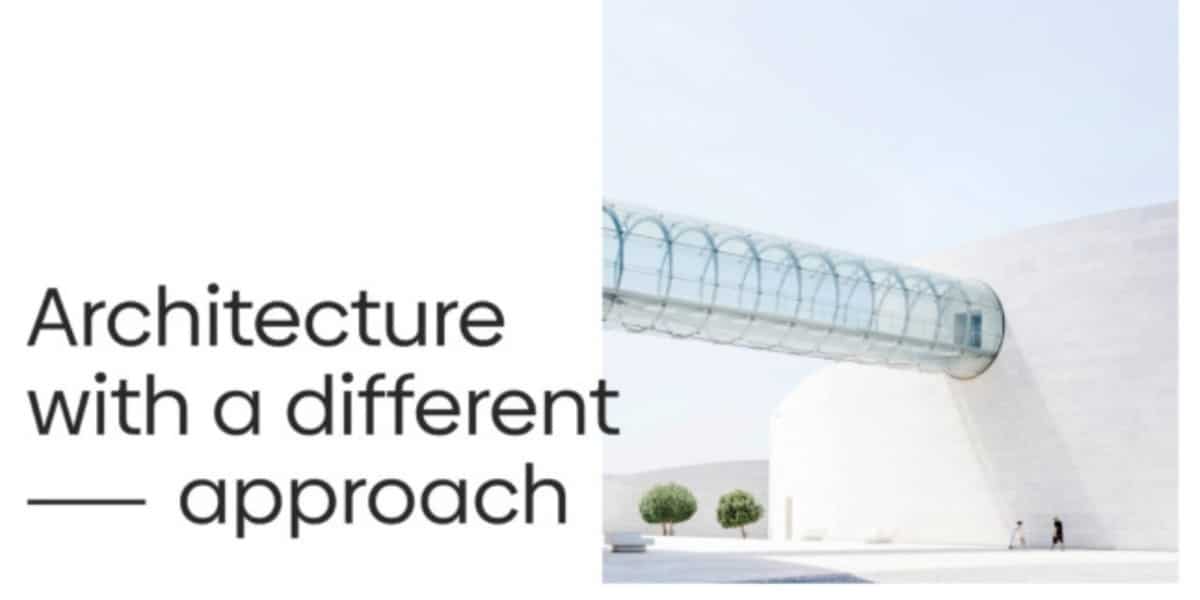
Image Credit: Lukas Rudrof
Standout Features:
- Expansive use of positive space
- Ultra-minimalist design
- Conveys the brand’s vision
Lukas Rudrof designed the website of AR-CO, an international architecture studio that focuses on environmentally sustainable projects. The design reflects the studio’s proficiency and spirit of sustainability.
AR-CO’s ethos of less is more in full effect, with the sparsity of positive space, resulting in an ultra-minimalist layout that skips excessive decoration. The result is an appealing black-and-white design which combines real life image with content-driven text.
It then showcases past work in simple and clean categories with bold headers so as to not distract from the most important information. Rather than going with the standard About page, the site leads with a blurb on the studio’s ethos, playing up its important mission over the people the individuals who make up the team.
5. Katya Smolianinova
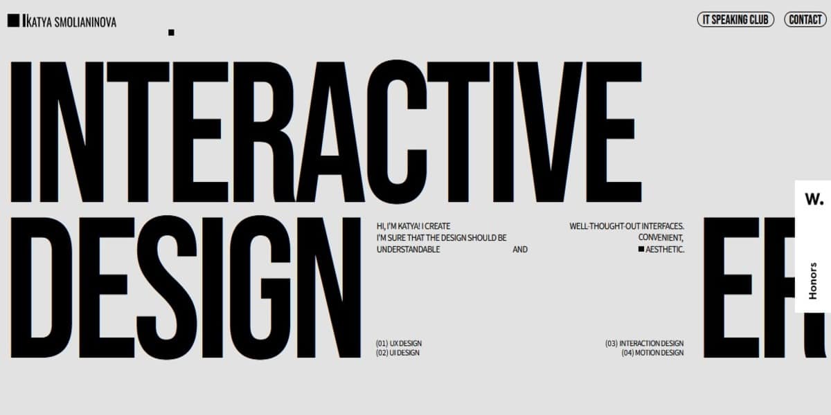
Image Credit: katyasmolianinova.com
Standout Features:
- Heavy headline typography.
- A single-page layout.
- Dynamic past work showcase.
Katya Smolianinova is a stylish and simple portfolio website. Upon first landing on its home page, you can see a direct approach to styling in the loud headline typography. It serves as a mini About me page sharing key info about the website’s owner and her expertise.
This single-page site demonstrates how, as you scroll down, it becomes a linear representation of Katya’s work. A teaser and image for each project are to the right, with a bold bar code in the bottom left corner that verifies its authentic identity.
Final Thoughts on Modern Website Design
In 2025, modern web design trends are a mix of technology, aesthetics, and user-centric principles. Moving forward, we will see sites that are beautiful as well as highly functional, accessible and secure. Keeping up with these trends will be important for businesses and designers alike, who want to make their presence felt in the digital space.
Do you have a team in need on tools to collaborate efficiently? Check these online collaboration tools that will make work more organized. Finally, contact us when you need a team of SEO experts to start ranking and get more quality traffic. You can also connect with us on Facebook or LinkedIn.
Images without credit are from Pixabay.com

Top eCommerce Plugins for Creative Agencies to Sell Digital Products
Since blockchain technology is public, how are users’ identities protected?